Create and Attach Forms to Services
In this guide, you'll learn how to create a form for customers to submit responses to whilst purchasing a service, and how to attach it to a service.
Overview
Forms contain one or more fields for the customer to provide responses to before purchasing a service. Forms can be created and managed using the form builder, and then attached to the relevant services.
Creating a Form
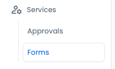
- To begin creating a form, navigate to the
Formspage within theServicesarea of the platform.
- Click the
+ Add formbutton.

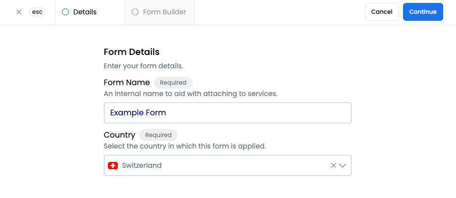
- Enter the name for the form and select the country where the form will be applied.
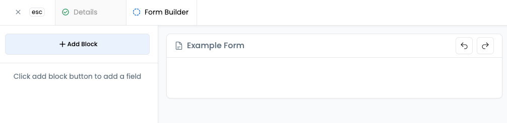
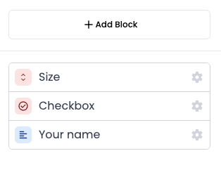
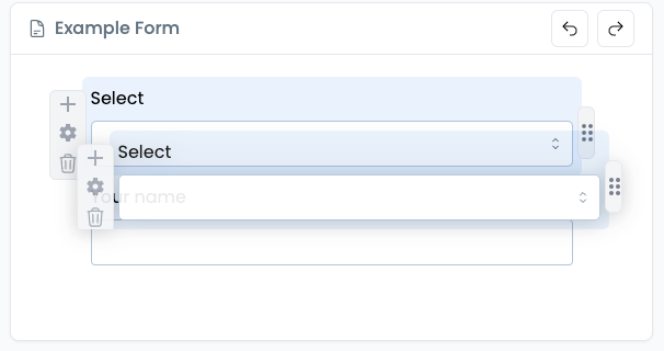
- Click
+ Add Blockto begin adding your first field to the form.
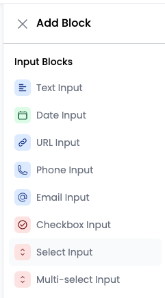
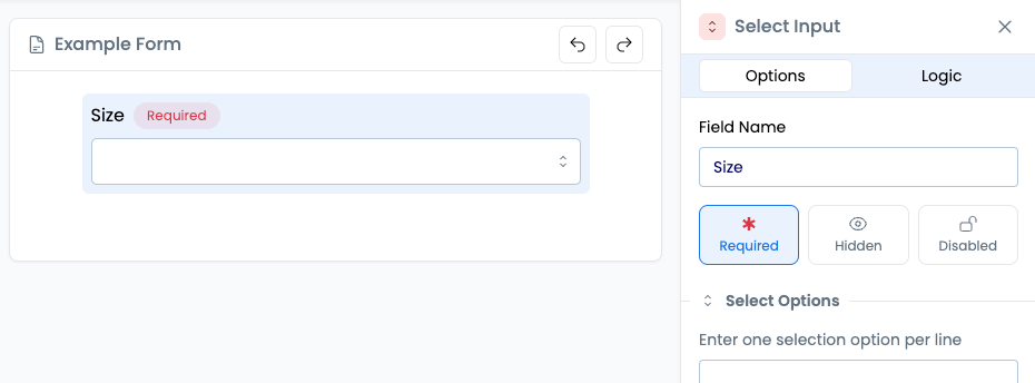
- Select the type of input block to add e.g.
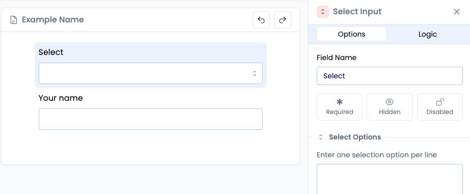
Select Inputfor a dropdown field where a single choice is selected by the user. See Field Options for details on each block.
- Configure the field by populating the options tab. For full details on the options for each field type see Field Options.
- Add any additional fields and configure the details as needed.
- Add any desired logic to the form, such as price increases based on certain user selections, by navigating to the
Logictab from any field. See Form Logic for full details on applying logic.
- Click
Saveto finish creating the form.

Form Builder Tips
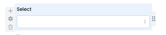
Form Preview Area
Hovering over a field in the form preview area will display several button:
- The
+button is a shortcut for adding a new field. - The settings cog opens the options pane to edit the details for that field. Clicking the blue area will also open the pane.
- The bin icon will remove the field form the form.
- The icon on the right hand side allows you to click and drag the field to a new position in the form.
Actions can be undone and redone by clicking the left and right arrows respectively in the top right of the form preview area.
Field Options
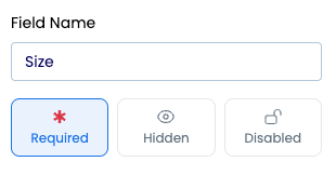
Summary
Each field type has a name field and a button for selecting whether it is required for the customer to populate or not. There are two additional buttons for hiding a field from customers, or disabling it from being used (but remaining visible to users).
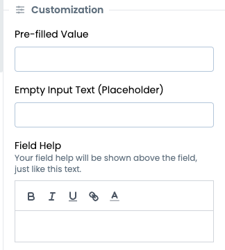
Each field type may also have some or all of the following Customization options:
- Pre-filled value
- Empty Input Text (Placeholder)
- Field Help
The following field types are available:
| Type | Description |
|---|---|
Text | A text entry box, either single line or multi-line |
Date | A date picker |
URL | Accepts only valid URLs |
Phone | Accepts only valid phone numbers |
Email | Accepts only valid email addresses |
Checkbox | A checkbox that can be ticked or unticked |
Select | A dropdown where one option can be selected |
Multi-select | A dropdown where multiple options can be selected |
Number | Accepts only a number |
Rating | A number of stars up to a maximum can be selected |
Scale | A numerical option can be selected by clicking a box in a range |
Slider | A numerical option can be selected by dragging a slider |
File | A single file or multiple files can be attached |
Signature | A signature can be provided |
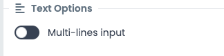
Text
A text entry box. This will be single line input by default but multi-lines input can be enabled in the options.
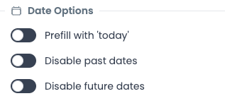
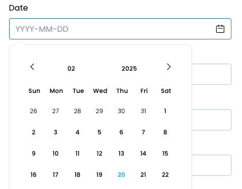
Date
A date picker. The field options allow the field to be prefilled with the current date, past dates to not be selectable, and future dates to not be selectable.
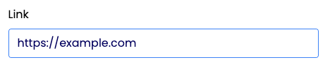
URL
Accepts only valid URLs. There are no additional options for this field type.
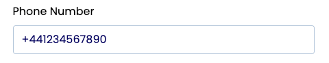
Phone
Accepts only valid phone numbers. There are no additional options for this field type.
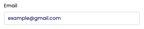
Email
Accepts only valid email addresses. There are no additional options for this field type.
Checkbox
A checkbox that can be ticked or unticked. There are no additional options for this field type.

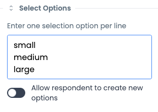
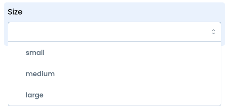
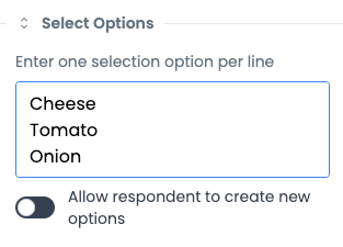
Select
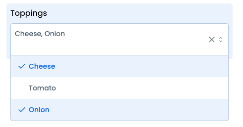
A dropdown where one option can be selected. The field options enable you to provide the possible selections by entering one per line. Respondents can also be allowed to add their own options.
Multi-select
A dropdown where multiple options can be selected. The field options enable you to provide the possible selections by entering one per line. Respondents can also be allowed to add their own options.
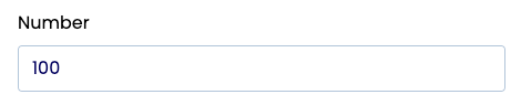
Number
Accepts only a number. There are no additional options for this field type.
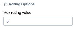
Rating
A number of stars up to a maximum can be selected. The options allow for a maximum rating to be set.

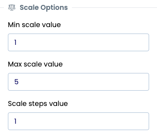
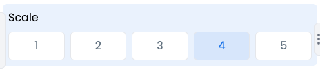
Scale
A numerical option can be selected by clicking a box in a specified range. The options allow for mininum, maximum and step size values to be set.
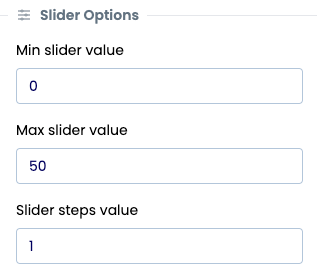
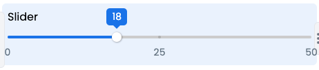
Slider
A numerical option can be selected by dragging a slider in a specified range. The options allow for mininum, maximum and step size values to be set.
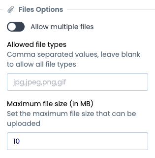
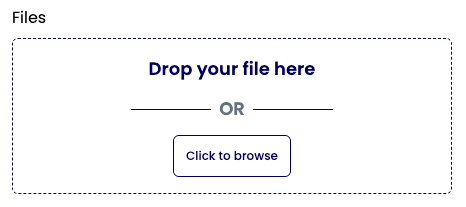
File
A single file or multiple files can be attached. Multiple files can be enabled in the options. Additionally, the allowed file types can be specified, along with a maximum file size in MB.
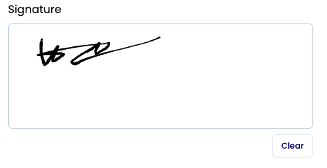
Signature
A signature can be provided. There are no additional options for this field type.
Form Logic
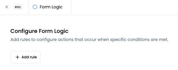
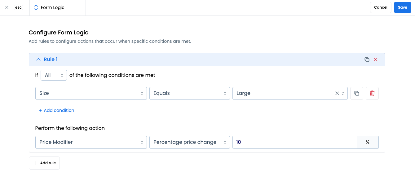
To implement logic for a form, select a field and then click the Logic tab - this will open the Logic page for the form.
You can add one or more rules to your form, where each rule has an associated action e.g. a price increase. Each rule can have one or more conditions, and these conditions can be connected with AND logic, or with OR logic, by selecting All or Any from the dropdown respectively.
A condition consists of 3 parts - the field, the logic and the field value. For example, a select (dropdown) field called Size, logic of Equals and a value of Large means that if a customer selects Large from the Size dropdown then the condition is met, and if it is the only condition then the action specified will be applied.
An action also consists of 3 parts - the type (currently just Price Modifier), the subtype and the value. For example, a subtype of Percentage price change and a value of 10 means that the price will increase by 10% when the conditions are met. To apply a decrease, enter a negative value such as -10.
Click Save to return to the form builder.
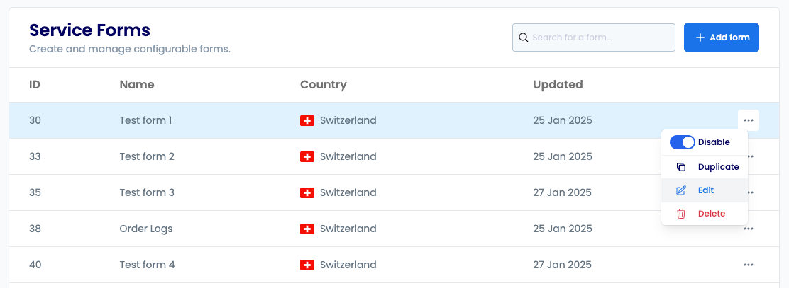
Managing Forms
To Edit, Duplicate or Delete a form, open the menu for the relevant form and select the appropriate option.
Selecting the Duplicate option will open the new form flow but prepopulated with the details of the form being duplicated. These details can then be edited as needed before completing the creation of the new form.
Attaching Forms to Services
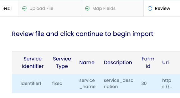
Attaching Using Services Import CSV
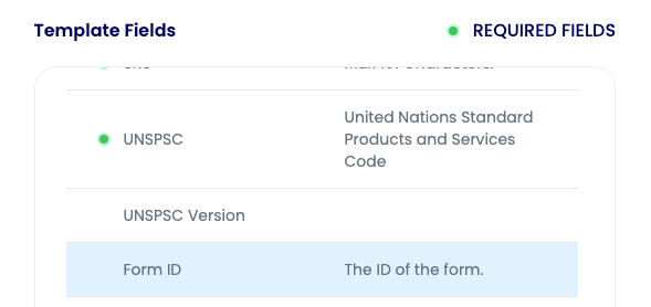
When importing a services CSV file, the Form ID field (form_id) can be included to immeadiately attach forms to relevan services. The Form ID can be obtained from the Forms page.
Attaching Using the UI
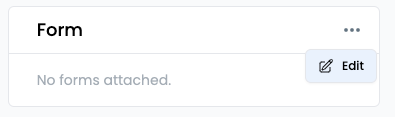
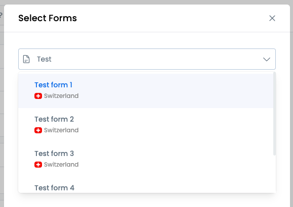
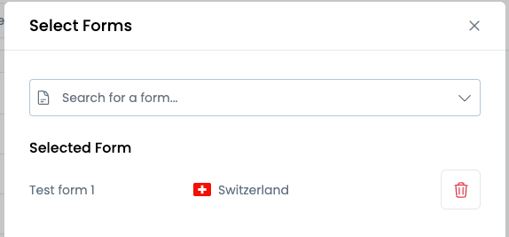
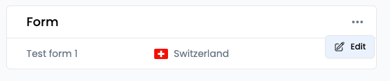
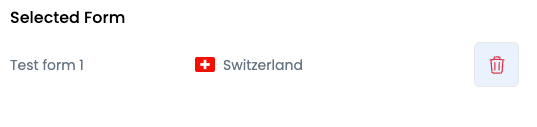
A form can be attached to a service from the service details page. Navigate to the details page for the relevant service and click Edit from the menu button of the Form panel to add or adjust the form for this service. Click Save once you have finished.
Removing Forms from Services
To remove a form from a service using the UI, click the menu button in the Form panel on a service details page, then select Edit. Remove the selected form and then click Save.
Form Creation Tutorial
This video guides you through the process of creating custom forms and understanding form configuration options.
Form Assignment Tutorial
This video shows how to attach forms to specific services and manage form assignments effectively.
- Overview
- Creating a Form
- Form Builder Tips
- Form Preview Area
- Field Options
- Summary
- Text
- Date
- URL
- Phone
- Checkbox
- Select
- Multi-select
- Number
- Rating
- Scale
- Slider
- File
- Signature
- Form Logic
- Managing Forms
- Attaching Forms to Services
- Attaching Using Services Import CSV
- Attaching Using the UI
- Removing Forms from Services
- Form Creation Tutorial
- Form Assignment Tutorial